Living, California-based artist Ed Ruscha uses the techniques of commercial art to interpret Pop art, Minimalism, and Conceptual art, with a dollop of Surrealism; hold the Expressionism.
It seems that all the elements of Ed Ruscha's mature style derive clearly from his formative experiences as an artist.
When he was first trying to make a name for himself in Los Angeles in the early 1960s, he knew that the problem of pronouncing his name would be a barrier, so he printed business cards that spelled it out phonetically: (Ed - werd Rew - shay).
Ruscha was born in Omaha (in 1937), but he was raised in Oklahoma City. His father was an auditor for an insurance company, and there were two other children in the Roman Catholic family. He showed an interest in cartooning at an early age, and his artistic talent was encouraged. When he was 18, in 1956, he and his friend Mason Williams, who later became a famous composer and guitarist, drove to Los Angeles in a 1950 Ford Sedan.
We can imagine him, still in his teens, at the peak of vulnerability to new impressions heading to California, a sort of promised land, in the footsteps of Okies and prospectors and pioneers of the previous century. Many of his most famous themes and images derived from that road trip, which he repeated many times in order to visit his family in Oklahoma City.
A road trip is inevitably dominated by gas stations, especially in those days, and by long hours of flat land and big skies, by signs and billboards, and by stories and dreams. Likewise, Ruscha's work is dominated by gas stations, sunsets, and signs, but he stripped these images of all sentimentality, all detail, all texture, all personality. The trip itself was almost incidental. What grabbed his imagination was the constant stream of words coming down the highway, and how their placement in the real world affected their meaning. He was one of the first artists to make words their primary subject, a trend that now includes several others. He once said, “I like the idea of a word becoming a picture, almost leaving its body, then coming back and becoming a word again.”
When he got to Los Angeles, he was impressed by the glitter and speed of the Hollywood-driven cultural life, but he was also sensitive to a certain phoniness. He dwelt on symbols in the local culture, but his attitude was always ambivalent, which led to sly humor.
In L.A., Ruscha attended Chouinard Art Institute, which is now known as the California Institute of the Arts, and made friends with several talented artists. His training was rooted in commercial art, and he began his career as a layout artist for an advertising agency, and later for a magazine. However, he pursued personal art projects at the same time, and he was soon able to become a full-time artist.
Through October 9, 2016, the De Young Museum in San Francisco is hosting an exhibition of his works called "Ed Ruscha and the Great American West" which shows words and scenes related to the road trip and to Hollywood.
The only problem with this exhibit is that it gives the impression of an orderly artist with a conscious plan, whereas a little research on his career shows that his creativity is so profuse and uninhibited that it seems compulsive. In addition to painting, drawing and printmaking, he also worked in photography and film. For instance, he published a book called
Every Building on the Sunset Strip, which included a photo of every building in a 2 1/2 mile stretch of the famous boulevard. Later he photographed the entire length of Hollywood Boulevard with a motorized camera. This exhibit is mainly paintings and prints, but, similarly, each work is actually part of a long series on the same theme.
Although Ruscha soon rejected commercial art as a career path, he continued using its techniques and its flat, machine-made look, and to apply it to various aesthetic goals. He was associated with Pop Art before it even had a name because he was interested in the signs and symbols used in street advertising. He was part of a new direction in art that dealt with the observable world, as opposed to the opposing trend of exposing the inner world through Abstract Expressionism, which was dominant at the time.
Minimalism is expressed in Ruscha's work by strong geometry and extreme simplification of forms, as well as by his works in a series, exploring variations of a simple theme. Often his works include oddball juxtapositions, which stimulate thoughts far beyond the canvas, like Conceptual art or Surrealism. He broke the mold of high seriousness in art by introducing a certain light-hearted skepticism. He says, "Art has to be something that makes you scratch your head," and his does.
In one of his first famous images, he uses the elements of graphic design—simplification, geometry, even rays like searchlights—to focus all our attention on the word "Standard," with all its possible ramifications on the road. The gas station glows and beckons in the dark night like a temple or a nightclub, but the scene is so flat that what matters is the geometry of the black triangle, the red rectangles, the white space and the yellow rays. It reminds me of the spare geometry of Piet Mondrian and Ellsworth Kelly.
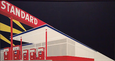 |
| Standard Station, Amarillo, Texas, 1963 |
If a gas station is a temple, then the ultimate iconoclasm is to burn the station down, as in the following image.
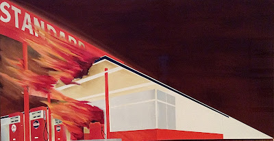 |
| Burning Gas Station, 1965-66 |
Ruscha kept a studio in West Hollywood for 20 years, and he could see the iconic
Hollywood sign whenever he stepped outside, if the smog wasn't too bad. The sign actually sits on the slope of the Hollywood hills, but the artist moved it to the crest so that he could juxtapose it with a perfect sunset. He strips out all texture and detail so our attention is focussed on the word and the sunset, both bearing a rich load of meanings. His ultra-wide canvas uses the proportions of Cinemascope movies to reinforce the implications.
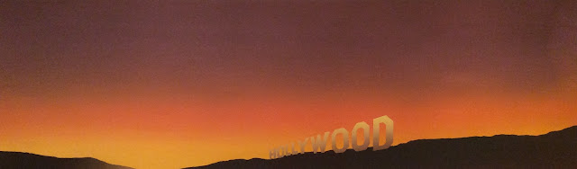 |
| Hollywood, 1968 |
A decade later, he bumped up the humor by reversing the lettering, as though we were beyond the sign, beyond the fabled goal, looking backward—and we're still looking west, into a sunset whose redding glow is somewhat alarming.
 |
| The Back of Hollywood, 1977 |
As a person who was fascinated by typefaces and controlled application of paint, Ruscha inevitably asked himself, what if lettering lost its hard edge? what if letters were poured or dripped, instead of being applied by brush or by printer's press? This led to a long series of quirky word paintings that are definitely minimalist, conceptualist, and iconoclastic. In the following painting, we are finally forced to ask, What is a rancho, anyway? The darkening sunset keeps the mood from being too jolly.
 |
| Rancho, 1968 |
In the next one, the West is symbolized by the vast ocean, and the watery word "Western" is barely even legible, like an illusion on a wet window. The artist threw in a couple of highly realistic marbles, lest we get too comfortable with this joke.
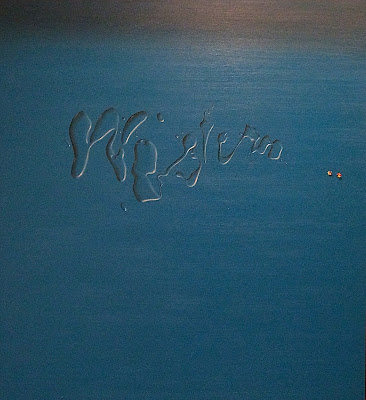 |
| Western, with Two Marbles, 1969 |
Just as inevitably, Ruscha returned to his favored boxy typeface. The following painting has particular significance for art lovers in the S.F. Bay area because 40 years after it was painted, the de Young Museum commissioned a 3-part mural version of the same theme for the opening of their new building. This painting gives us a band of dark ocean, a rather anemic, smoggy sunset, and the ambiguous saying, "A Particular Kind of Heaven." Not the only kind of Heaven, maybe not even the best kind. How would you define Heaven anyway?
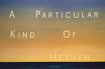 |
| A Particular Kind of Heaven, 1983 |
Similar types of ambiguities are expressed in the next painting (the slant is due to a technical glitch). My first response was to think of Los Angeles traffic, and then Bay Area traffic; and then I began to wonder just where "Here" is; not necessarily L.A. or S.F. or anywhere on earth. Why does the sky progress from dark to light, along with the text? Does here have something to do with Heaven, or Eternity?
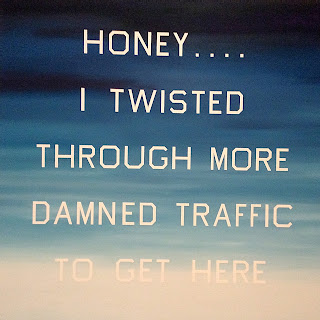 |
| Honey…I Twisted Through More Damned Traffic to Get Here, 1984 |
Pop Art is about the mundane images and words of everyday life. The next painting shows how the meaning of a word is affected by its placement on a building. The ominous sky adds a surreal overtone which might make us worry about the negative consequences of basing a culture on automobiles and highways.
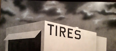 |
| Blue Collar Tires, 1992 |
If you drive the same streets year after year, you can chart the changing population by the changing languages of the street advertising. Ruscha is interested in letter-forms in different languages, including the one in this painting, which is indecipherable. The sky seems to express the poignancy of changing times.
 |
| The Old Tool & Die Building, 2004 |
In the pictures we've looked at so far, the background generally seems to enhance the meaning, but sometimes Ruscha likes to create a contrast between the words and the background; the art is conceptual because it forces you to wonder if there is a relationship. In the next painting, the artist juxtaposed the names of streets in West Hollywood, in their approximate arrangement on a map, with an idealized, anonymous mountain, such as you might see in an attitude-building poster on Ambition or Purpose.
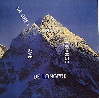 |
| La Brea, Sunset, Orange, De Longpre, 1999 |
The following example is even vaguer. (Again, the slant is a technical glitch.) Ruscha hears people using an expression like "God knows where…", and he wonders just what it might mean, literally. We have to ask, who is God, what is Knowing, and where is where?
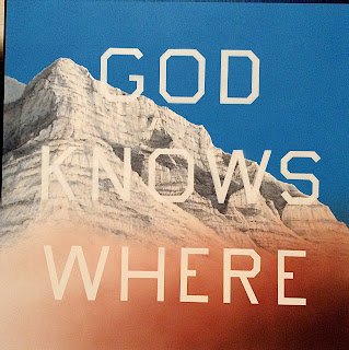 |
| God Knows Where, 2014 |
In his contrarian manner, Ruscha eventually asked himself, how could I evoke words without actually painting the words themselves. Anyone who has driven the state highways between California and Oklahoma recognizes from afar the silhouette of the Welcome-to-town sign, with its cluster of smaller signs for the town's churches. But the fact that the signs are blank in the painting makes us think of the fading impact of churches on American life.
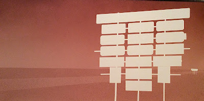 |
| Pahrump Signage, c. 2003 |
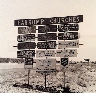 |
| Pahrump Signage, c. 2003, photo |
Over the years, several of Ruscha's paintings have been occupied with the words "The End," as in the end of the movie, or the end of the book, or maybe the end of the world. He looks for images that use minimal means to express this idea. In this early example, he uses a reflection of a window on the floor. My photo is complicated by the glass over the image which reflected my iPad and the paintings across the room (and a slant due to a glitch).
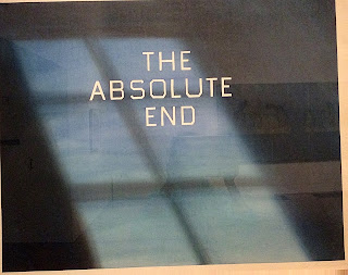 |
| The Absolute End, 1982 |
In the next example he actually uses Gothic letterforms, and yellow marks that first look like flames, but then subside to dried grasses.
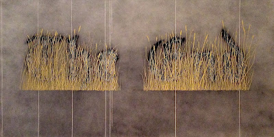 |
| The Final End, 1991-1992 |
Recently, he came up with an especially humorous version of this theme.
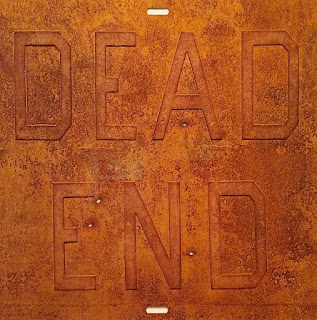 |
| Rusty Signs – Dead End 2, 2014 |
Ed Ruscha is not a cozy, friendly sort of artist, who creates works that appeal to our senses or our sentiments; he is a philosopher, whose works are hard and dry, analytical and skeptical, with a wry twist of humor expressing his ambiguity. Ruscha is like a stand-up comic among artists; the current exhibit at the de Young will evoke a lot of laughs, if you can take a joke.