The reason I don't go to more plays is that most of the plays offered in my area seem dumb to me: obvious, corny, pandering to popular trends—with all due respect for differences in taste. The only works with depth are the old classics, Death of a Salesman, and all that, and I've seen all that stuff. Beautiful as the works of Arthur Miller and Eugene O'Neill may be, they are relics of another era.
How would you go about writing a thoroughly modern play? Artists of the early 20th century had a similar problem. Picasso admired Renoir and collected one of his works, but those hazy nudes and dappled outdoor parties just weren't relevant in an era of airplanes and relativity and devastating political conflicts. It's not just that the subjects were old-hat, the whole style of painting from the early Renaissance forward seemed too tame, too controlled, too idealized for the explosive modern era.
Picasso and the other young artists of the early 1900s were driven to deconstruct the basic idea of painting. Artists began to ask, what else can art do? What else can you do with paint and canvas other than depict the conventional pseudo-photograhic reality that was the standard? The most obvious example is the development of Cubism, which aimed to express in paint the fact that "reality" depends on your point of view, by showing various views of a figure or object at the same time. Cubism had many more facets, but it's a clear-cut example of the way artists analyzed every aspect of art—colors, shapes, application of paint, symbolism, etc.—over the next several decades. Eventually they came to the very concept behind a work of art, and developed a type of art known as Conceptualism, in which the execution of the work was less important than the original concept, and for which the basic intention is to blow your mind.
This is where A Map of Virtue comes in. The playwright, Erin Courtney, started as an artist herself, and like Picasso, she has deconstructed theater itself. What else can you do with actors and a stage and props and all the paraphernalia of theater other than make some half-baked depiction of reality? The form she has created is brand new, at least in my experience. Poetic recitations are mixed with musical interludes, dramatic scenes, and direct address to the audience. Everything is held together by a riveting sound design.
Another innovation that Erin brings to theater is personal vision. Traditionally, theater is based on shared perceptions by the community, while painting is a mode of personal expression. To me it seems that Erin is expressing ideas that are significant in her life, saying the things that need to be said for her artistic fulfillment.
The most confusing thing about the play is the title. There is no Map of Virtue, and these characters definitely need one. To compound the confusion, there appears to be a map, or at least an outline, of virtues—curiosity, honesty, intuition, etc.—which underpins the action. A talking bird statue announces them portentously, but you wait in vain to see them exemplified on stage. On the contrary, the characters haven't got a clue. The basic nightmare in this play is that the characters have no direction: no values, no intentions. They do random things for unknown reasons, and because of that, they are subject to the whims of fate, which predictably have dangerous effects.
The one virtue you can observe in this play is intuition. Three of the characters are kidnapped and experience a few terrifying nights in the custody of two armed and unpredictable captors. They are rescued by Victor, boyfriend of one of the characters, because his intuition told him his friend was in trouble. But where did that intuition come from? Didn't it come from love? Is love finally the map of virtue?
If you go to the theater to have your old assumptions confirmed, don't bother with Erin Courtney's A Map of Virtue. You're not going to leave the theater saying, "Wow." You're going to be saying, "Huh?" And then you're going to find yourself thinking and thinking. If you'd like to blast away the cobwebs and come into the 21st century of theatrical possibilities, see this play. Then see it again.
Unfortunately, the production I saw of this play, by Barker Room Rep in Los Angeles has almost finished its run. As I write, there are only 3 more performances.
Barker Room Rep is a new theater company to Los Angeles, founded by Mark Sitko, who first established himself in Brooklyn, where they actually know what theater is about. Like Erin, Mark wants to shake the ingredients of theater up and pour out something new and innovative. What would be totally new in theater? Well, work by women for one thing. And what about all the other writers who have been marginalized by a stodgy theatrical industry? Mark's dream is to build an inclusive theater community by dealing with contemporary concerns in an innovative manner. We could use it.
Get tickets
Thursday, November 16, 2017
Monday, August 22, 2016
Ed Ruscha: Commercial Art Meets Fine Art
Living, California-based artist Ed Ruscha uses the techniques of commercial art to interpret Pop art, Minimalism, and Conceptual art, with a dollop of Surrealism; hold the Expressionism.
It seems that all the elements of Ed Ruscha's mature style derive clearly from his formative experiences as an artist.
When he was first trying to make a name for himself in Los Angeles in the early 1960s, he knew that the problem of pronouncing his name would be a barrier, so he printed business cards that spelled it out phonetically: (Ed - werd Rew - shay).
Ruscha was born in Omaha (in 1937), but he was raised in Oklahoma City. His father was an auditor for an insurance company, and there were two other children in the Roman Catholic family. He showed an interest in cartooning at an early age, and his artistic talent was encouraged. When he was 18, in 1956, he and his friend Mason Williams, who later became a famous composer and guitarist, drove to Los Angeles in a 1950 Ford Sedan.
We can imagine him, still in his teens, at the peak of vulnerability to new impressions heading to California, a sort of promised land, in the footsteps of Okies and prospectors and pioneers of the previous century. Many of his most famous themes and images derived from that road trip, which he repeated many times in order to visit his family in Oklahoma City.
A road trip is inevitably dominated by gas stations, especially in those days, and by long hours of flat land and big skies, by signs and billboards, and by stories and dreams. Likewise, Ruscha's work is dominated by gas stations, sunsets, and signs, but he stripped these images of all sentimentality, all detail, all texture, all personality. The trip itself was almost incidental. What grabbed his imagination was the constant stream of words coming down the highway, and how their placement in the real world affected their meaning. He was one of the first artists to make words their primary subject, a trend that now includes several others. He once said, “I like the idea of a word becoming a picture, almost leaving its body, then coming back and becoming a word again.”
When he got to Los Angeles, he was impressed by the glitter and speed of the Hollywood-driven cultural life, but he was also sensitive to a certain phoniness. He dwelt on symbols in the local culture, but his attitude was always ambivalent, which led to sly humor.
In L.A., Ruscha attended Chouinard Art Institute, which is now known as the California Institute of the Arts, and made friends with several talented artists. His training was rooted in commercial art, and he began his career as a layout artist for an advertising agency, and later for a magazine. However, he pursued personal art projects at the same time, and he was soon able to become a full-time artist.
Through October 9, 2016, the De Young Museum in San Francisco is hosting an exhibition of his works called "Ed Ruscha and the Great American West" which shows words and scenes related to the road trip and to Hollywood.
The only problem with this exhibit is that it gives the impression of an orderly artist with a conscious plan, whereas a little research on his career shows that his creativity is so profuse and uninhibited that it seems compulsive. In addition to painting, drawing and printmaking, he also worked in photography and film. For instance, he published a book called Every Building on the Sunset Strip, which included a photo of every building in a 2 1/2 mile stretch of the famous boulevard. Later he photographed the entire length of Hollywood Boulevard with a motorized camera. This exhibit is mainly paintings and prints, but, similarly, each work is actually part of a long series on the same theme.
Although Ruscha soon rejected commercial art as a career path, he continued using its techniques and its flat, machine-made look, and to apply it to various aesthetic goals. He was associated with Pop Art before it even had a name because he was interested in the signs and symbols used in street advertising. He was part of a new direction in art that dealt with the observable world, as opposed to the opposing trend of exposing the inner world through Abstract Expressionism, which was dominant at the time.
Minimalism is expressed in Ruscha's work by strong geometry and extreme simplification of forms, as well as by his works in a series, exploring variations of a simple theme. Often his works include oddball juxtapositions, which stimulate thoughts far beyond the canvas, like Conceptual art or Surrealism. He broke the mold of high seriousness in art by introducing a certain light-hearted skepticism. He says, "Art has to be something that makes you scratch your head," and his does.
In one of his first famous images, he uses the elements of graphic design—simplification, geometry, even rays like searchlights—to focus all our attention on the word "Standard," with all its possible ramifications on the road. The gas station glows and beckons in the dark night like a temple or a nightclub, but the scene is so flat that what matters is the geometry of the black triangle, the red rectangles, the white space and the yellow rays. It reminds me of the spare geometry of Piet Mondrian and Ellsworth Kelly.
If a gas station is a temple, then the ultimate iconoclasm is to burn the station down, as in the following image.
Ruscha kept a studio in West Hollywood for 20 years, and he could see the iconic Hollywood sign whenever he stepped outside, if the smog wasn't too bad. The sign actually sits on the slope of the Hollywood hills, but the artist moved it to the crest so that he could juxtapose it with a perfect sunset. He strips out all texture and detail so our attention is focussed on the word and the sunset, both bearing a rich load of meanings. His ultra-wide canvas uses the proportions of Cinemascope movies to reinforce the implications.
A decade later, he bumped up the humor by reversing the lettering, as though we were beyond the sign, beyond the fabled goal, looking backward—and we're still looking west, into a sunset whose redding glow is somewhat alarming.
As a person who was fascinated by typefaces and controlled application of paint, Ruscha inevitably asked himself, what if lettering lost its hard edge? what if letters were poured or dripped, instead of being applied by brush or by printer's press? This led to a long series of quirky word paintings that are definitely minimalist, conceptualist, and iconoclastic. In the following painting, we are finally forced to ask, What is a rancho, anyway? The darkening sunset keeps the mood from being too jolly.
In the next one, the West is symbolized by the vast ocean, and the watery word "Western" is barely even legible, like an illusion on a wet window. The artist threw in a couple of highly realistic marbles, lest we get too comfortable with this joke.
Just as inevitably, Ruscha returned to his favored boxy typeface. The following painting has particular significance for art lovers in the S.F. Bay area because 40 years after it was painted, the de Young Museum commissioned a 3-part mural version of the same theme for the opening of their new building. This painting gives us a band of dark ocean, a rather anemic, smoggy sunset, and the ambiguous saying, "A Particular Kind of Heaven." Not the only kind of Heaven, maybe not even the best kind. How would you define Heaven anyway?
Similar types of ambiguities are expressed in the next painting (the slant is due to a technical glitch). My first response was to think of Los Angeles traffic, and then Bay Area traffic; and then I began to wonder just where "Here" is; not necessarily L.A. or S.F. or anywhere on earth. Why does the sky progress from dark to light, along with the text? Does here have something to do with Heaven, or Eternity?
Pop Art is about the mundane images and words of everyday life. The next painting shows how the meaning of a word is affected by its placement on a building. The ominous sky adds a surreal overtone which might make us worry about the negative consequences of basing a culture on automobiles and highways.
If you drive the same streets year after year, you can chart the changing population by the changing languages of the street advertising. Ruscha is interested in letter-forms in different languages, including the one in this painting, which is indecipherable. The sky seems to express the poignancy of changing times.
In the pictures we've looked at so far, the background generally seems to enhance the meaning, but sometimes Ruscha likes to create a contrast between the words and the background; the art is conceptual because it forces you to wonder if there is a relationship. In the next painting, the artist juxtaposed the names of streets in West Hollywood, in their approximate arrangement on a map, with an idealized, anonymous mountain, such as you might see in an attitude-building poster on Ambition or Purpose.
The following example is even vaguer. (Again, the slant is a technical glitch.) Ruscha hears people using an expression like "God knows where…", and he wonders just what it might mean, literally. We have to ask, who is God, what is Knowing, and where is where?
In his contrarian manner, Ruscha eventually asked himself, how could I evoke words without actually painting the words themselves. Anyone who has driven the state highways between California and Oklahoma recognizes from afar the silhouette of the Welcome-to-town sign, with its cluster of smaller signs for the town's churches. But the fact that the signs are blank in the painting makes us think of the fading impact of churches on American life.
Over the years, several of Ruscha's paintings have been occupied with the words "The End," as in the end of the movie, or the end of the book, or maybe the end of the world. He looks for images that use minimal means to express this idea. In this early example, he uses a reflection of a window on the floor. My photo is complicated by the glass over the image which reflected my iPad and the paintings across the room (and a slant due to a glitch).
In the next example he actually uses Gothic letterforms, and yellow marks that first look like flames, but then subside to dried grasses.
Recently, he came up with an especially humorous version of this theme.
Ed Ruscha is not a cozy, friendly sort of artist, who creates works that appeal to our senses or our sentiments; he is a philosopher, whose works are hard and dry, analytical and skeptical, with a wry twist of humor expressing his ambiguity. Ruscha is like a stand-up comic among artists; the current exhibit at the de Young will evoke a lot of laughs, if you can take a joke.
It seems that all the elements of Ed Ruscha's mature style derive clearly from his formative experiences as an artist.
When he was first trying to make a name for himself in Los Angeles in the early 1960s, he knew that the problem of pronouncing his name would be a barrier, so he printed business cards that spelled it out phonetically: (Ed - werd Rew - shay).
Ruscha was born in Omaha (in 1937), but he was raised in Oklahoma City. His father was an auditor for an insurance company, and there were two other children in the Roman Catholic family. He showed an interest in cartooning at an early age, and his artistic talent was encouraged. When he was 18, in 1956, he and his friend Mason Williams, who later became a famous composer and guitarist, drove to Los Angeles in a 1950 Ford Sedan.
We can imagine him, still in his teens, at the peak of vulnerability to new impressions heading to California, a sort of promised land, in the footsteps of Okies and prospectors and pioneers of the previous century. Many of his most famous themes and images derived from that road trip, which he repeated many times in order to visit his family in Oklahoma City.
A road trip is inevitably dominated by gas stations, especially in those days, and by long hours of flat land and big skies, by signs and billboards, and by stories and dreams. Likewise, Ruscha's work is dominated by gas stations, sunsets, and signs, but he stripped these images of all sentimentality, all detail, all texture, all personality. The trip itself was almost incidental. What grabbed his imagination was the constant stream of words coming down the highway, and how their placement in the real world affected their meaning. He was one of the first artists to make words their primary subject, a trend that now includes several others. He once said, “I like the idea of a word becoming a picture, almost leaving its body, then coming back and becoming a word again.”
When he got to Los Angeles, he was impressed by the glitter and speed of the Hollywood-driven cultural life, but he was also sensitive to a certain phoniness. He dwelt on symbols in the local culture, but his attitude was always ambivalent, which led to sly humor.
In L.A., Ruscha attended Chouinard Art Institute, which is now known as the California Institute of the Arts, and made friends with several talented artists. His training was rooted in commercial art, and he began his career as a layout artist for an advertising agency, and later for a magazine. However, he pursued personal art projects at the same time, and he was soon able to become a full-time artist.
Through October 9, 2016, the De Young Museum in San Francisco is hosting an exhibition of his works called "Ed Ruscha and the Great American West" which shows words and scenes related to the road trip and to Hollywood.
The only problem with this exhibit is that it gives the impression of an orderly artist with a conscious plan, whereas a little research on his career shows that his creativity is so profuse and uninhibited that it seems compulsive. In addition to painting, drawing and printmaking, he also worked in photography and film. For instance, he published a book called Every Building on the Sunset Strip, which included a photo of every building in a 2 1/2 mile stretch of the famous boulevard. Later he photographed the entire length of Hollywood Boulevard with a motorized camera. This exhibit is mainly paintings and prints, but, similarly, each work is actually part of a long series on the same theme.
Although Ruscha soon rejected commercial art as a career path, he continued using its techniques and its flat, machine-made look, and to apply it to various aesthetic goals. He was associated with Pop Art before it even had a name because he was interested in the signs and symbols used in street advertising. He was part of a new direction in art that dealt with the observable world, as opposed to the opposing trend of exposing the inner world through Abstract Expressionism, which was dominant at the time.
Minimalism is expressed in Ruscha's work by strong geometry and extreme simplification of forms, as well as by his works in a series, exploring variations of a simple theme. Often his works include oddball juxtapositions, which stimulate thoughts far beyond the canvas, like Conceptual art or Surrealism. He broke the mold of high seriousness in art by introducing a certain light-hearted skepticism. He says, "Art has to be something that makes you scratch your head," and his does.
In one of his first famous images, he uses the elements of graphic design—simplification, geometry, even rays like searchlights—to focus all our attention on the word "Standard," with all its possible ramifications on the road. The gas station glows and beckons in the dark night like a temple or a nightclub, but the scene is so flat that what matters is the geometry of the black triangle, the red rectangles, the white space and the yellow rays. It reminds me of the spare geometry of Piet Mondrian and Ellsworth Kelly.
 |
| Standard Station, Amarillo, Texas, 1963 |
 |
| Burning Gas Station, 1965-66 |
 |
| Hollywood, 1968 |
 |
| The Back of Hollywood, 1977 |
 |
| Rancho, 1968 |
 |
| Western, with Two Marbles, 1969 |
 |
| A Particular Kind of Heaven, 1983 |
 |
| Honey…I Twisted Through More Damned Traffic to Get Here, 1984 |
 |
| Blue Collar Tires, 1992 |
 |
| The Old Tool & Die Building, 2004 |
 |
| La Brea, Sunset, Orange, De Longpre, 1999 |
 |
| God Knows Where, 2014 |
 |
| Pahrump Signage, c. 2003 |
 |
| Pahrump Signage, c. 2003, photo |
Over the years, several of Ruscha's paintings have been occupied with the words "The End," as in the end of the movie, or the end of the book, or maybe the end of the world. He looks for images that use minimal means to express this idea. In this early example, he uses a reflection of a window on the floor. My photo is complicated by the glass over the image which reflected my iPad and the paintings across the room (and a slant due to a glitch).
 |
| The Absolute End, 1982 |
In the next example he actually uses Gothic letterforms, and yellow marks that first look like flames, but then subside to dried grasses.
 |
| The Final End, 1991-1992 |
 |
| Rusty Signs – Dead End 2, 2014 |

Tuesday, August 16, 2016
David Ligare: California Classicist
David Ligare is a classical realist painter who lives in the mountains of Monterey County. His home overlooks country much like this painting; I fear that country may be burning as I write (August, 2016).
I've been noticing his work for a few years, so I was delighted that a survey was exhibited at the Triton Museum in Santa Clara, hardly 15 minutes from my house.
The first of his paintings to catch my eye was this one, which is owned by the San Jose Museum of Art. Unfortunately, at the Triton, a spotlight cast a glare on the face of the rider. An ideal figure rides an ideal horse in ideal light. All the horizontal and vertical lines create stability and eternal ideals. The title, Arete, refers to the "innate excellence of the human spirit."
The Crocker Museum in Sacramento specializes in California artists, and they organized this exhibit, managing to secure loans from many individual collectors, as well as from museums as far away as the Museum of Modern Art in New York. Here's one of the Ligare works that belongs to the Crocker. The title, Penelope, refers to the long-suffering wife of a Greek hero named Odysseus who had many adventures on the way home from the war in Troy. Ligare updates the image just enough to connect it to the modern world as an eternal image of patient waiting. It is what it is.
Ligare is committed to classical aesthetic values, such as linear perspective. In the demonstration of linear perspective below, the spatial depth is convincing because all the lines that should be parallel converge at a single point in the center, through the open doorway, and the relative size of forms diminishes accordingly. The traditional story is that the architect Brunelleschi discovered linear perspective while making drawings of the Baptistry in Florence. Those drawings are lost, but they inspired this exercise.
The next example, from very early in Ligare's career, shows how he combines his love of the classical stories with his love of the California landscape. It illustrates an ancient Roman story about an poor, elderly couple called Baucis and Philemon who are the only people to offer hospitality to a pair of visiting gods, Jupiter (the top guy among the Greek deities) and Mercury (his messenger). Offended by the inhospitable town, the gods flood it, killing the inhabitants. As a reward to Baucus and Philemon, the gods turn their humble hut into a shining temple on the edge of the flood zone, and they allow the pair to die at the same time, something every loving couple longs for. After death the pair becomes entwined oak and linden trees, as shown here on the right. Ligare places the temple of their love on the shore of Lake Cachuma, a reservoir in Santa Ynez Valley.
Here's a similar example. The subtitle of this painting—(Veritas, Utilitas, Venustas)—refers to Roman principles of architecture: strength, usefulness, and grace. The arch, whether natural or man-made, symbolizes these qualities in their most elementary form.
Ligare is fascinated by the ancient stories of Greece and Rome. He was particularly interested in a hero named Hercules, the offspring of Jupiter and a mortal woman. Hercules was known for his strength and he had innumerable adventures requiring feats of strength, but the story that interested Ligare was the time that Hercules was required to chose between virtue and pleasure as a course of life. This has been a popular story among artists with classical leaning. Usually, pleasure is represented as a voluptuous woman and virtue is represented by a woman of ideal beauty, but during the Renaissance a German artist named Albrect Dürer introduced the idea of Hercules protecting Pleasure from an attack by Virtue, the idea being that humans should strike a balance between the two in the way they live.
In one of his paintings on this story, Ligare followed Dürer's example, although he reduced the composition to its essential elements. Notice that he traded serene horizontals and stable verticals for dynamic diagonal lines. The basket of fruit near the woman connects this story with that of Adam and Eve; Virtue's stance and look are just like those of the angel who drove Adam and Eve out of paradise for enjoying the fruit of knowledge; but in this case, the male character fights back instead of slinking away in shame.
In another painting, Ligare simplified the story even further, showing Hercules standing alone at a crossroads, choosing between the easy path of Pleasure along the silvery river or the hard path of Virtue through the rocks.
Another Greek hero who interests Ligare is Achilles, whose mother was a minor deity while his father was mortal. Achilles was one of Greece's greatest commanders in war, but he got into a snit and refused to enter the war against Troy. Finally, when Greece is on the verge of being overwhelmed by the Trojans, Achilles allows his best friend, Patroclus, to lead the troops into battle disguised as himself and wearing his armor. Patroclus leads the troops to victory, but he is killed in the process. In this painting, Patroclus' body has been retrieved from the battlefield by fellow warriors and brought back to Achilles. This becomes the turning point in the war. Achilles gets some new armor from his divine mother Thetis, and leads the Greeks in devastating Troy, not because he believes in their cause, but for his private revenge. The composition is a tumble of angles that alludes to the theme of the Deposition of Christ from the Cross, a common theme in religious painting. The subtitle of the painting—The Spoils of War—is charged with irony.
Even a still life can be ancient and modern at the same time—that is, eternal. The subtitle of the next painting—Xenia—refers to the Greek concept of hospitality where food and shelter are offered to strangers, as in Baucis and Philemon. Bologna sandwiches and grape juice was the typical meal offered to people at a homeless shelter run in Salinas where Ligare volunteered in the 1980s, but he has treated them with the reverence due a holy sacrament.
This final image epitomizes Ligare's values. In the first place, it refers back to a painting on the roof of a tomb that dates from the 400s BC, in a part of Southern Italy that was a Greek colony at that time. First the Greek original. My husband and I actually visited this tomb and saw this artwork amidst many other paintings on its walls. The diver is supposed to be launching himself toward Eternity.
In Ligare's version, the posture required to dive from a high perch symbolizes the perfect union of freedom and control. Perhaps the painter suggests that this is the proper attitude toward life. Instead of stable verticals or dramatic diagonals, the composition features a graceful curve, against the dependable horizon of the ocean. The emblem of the triangle within a circle within a square represents the Greek idea of perfect proportions.
It's unusual to encounter a painter with such a coherent philosophy and such commitment to expressing eternal values as David Ligare. It's unusual, and very, very satisfying.
Here's a photo of the artist that I grabbed from his website.
 |
| Corral de Tierra with White Cattle, 1999 |
I've been noticing his work for a few years, so I was delighted that a survey was exhibited at the Triton Museum in Santa Clara, hardly 15 minutes from my house.
The first of his paintings to catch my eye was this one, which is owned by the San Jose Museum of Art. Unfortunately, at the Triton, a spotlight cast a glare on the face of the rider. An ideal figure rides an ideal horse in ideal light. All the horizontal and vertical lines create stability and eternal ideals. The title, Arete, refers to the "innate excellence of the human spirit."
 |
| Arete (Black Figure on a White Horse), 2000 |
The Crocker Museum in Sacramento specializes in California artists, and they organized this exhibit, managing to secure loans from many individual collectors, as well as from museums as far away as the Museum of Modern Art in New York. Here's one of the Ligare works that belongs to the Crocker. The title, Penelope, refers to the long-suffering wife of a Greek hero named Odysseus who had many adventures on the way home from the war in Troy. Ligare updates the image just enough to connect it to the modern world as an eternal image of patient waiting. It is what it is.
 |
| Penelope, 1980 |
Ligare is committed to classical aesthetic values, such as linear perspective. In the demonstration of linear perspective below, the spatial depth is convincing because all the lines that should be parallel converge at a single point in the center, through the open doorway, and the relative size of forms diminishes accordingly. The traditional story is that the architect Brunelleschi discovered linear perspective while making drawings of the Baptistry in Florence. Those drawings are lost, but they inspired this exercise.
 |
| On Perspective, 2000 |
The next example, from very early in Ligare's career, shows how he combines his love of the classical stories with his love of the California landscape. It illustrates an ancient Roman story about an poor, elderly couple called Baucis and Philemon who are the only people to offer hospitality to a pair of visiting gods, Jupiter (the top guy among the Greek deities) and Mercury (his messenger). Offended by the inhospitable town, the gods flood it, killing the inhabitants. As a reward to Baucus and Philemon, the gods turn their humble hut into a shining temple on the edge of the flood zone, and they allow the pair to die at the same time, something every loving couple longs for. After death the pair becomes entwined oak and linden trees, as shown here on the right. Ligare places the temple of their love on the shore of Lake Cachuma, a reservoir in Santa Ynez Valley.
 |
| Landscape for Baucis and Philemon, 1984 |
Here's a similar example. The subtitle of this painting—(Veritas, Utilitas, Venustas)—refers to Roman principles of architecture: strength, usefulness, and grace. The arch, whether natural or man-made, symbolizes these qualities in their most elementary form.
 |
| Landscape with a Specific View (Veritas, Utilitas, Venustas), 1988 |
Ligare is fascinated by the ancient stories of Greece and Rome. He was particularly interested in a hero named Hercules, the offspring of Jupiter and a mortal woman. Hercules was known for his strength and he had innumerable adventures requiring feats of strength, but the story that interested Ligare was the time that Hercules was required to chose between virtue and pleasure as a course of life. This has been a popular story among artists with classical leaning. Usually, pleasure is represented as a voluptuous woman and virtue is represented by a woman of ideal beauty, but during the Renaissance a German artist named Albrect Dürer introduced the idea of Hercules protecting Pleasure from an attack by Virtue, the idea being that humans should strike a balance between the two in the way they live.
 |
| Albrect Dürer (1471-1528) Hercules at the Crossroads, 1498 Internet grab |
In one of his paintings on this story, Ligare followed Dürer's example, although he reduced the composition to its essential elements. Notice that he traded serene horizontals and stable verticals for dynamic diagonal lines. The basket of fruit near the woman connects this story with that of Adam and Eve; Virtue's stance and look are just like those of the angel who drove Adam and Eve out of paradise for enjoying the fruit of knowledge; but in this case, the male character fights back instead of slinking away in shame.
 |
| Hercules Protecting the Balance between Pleasure and Virtue, 1993 |
In another painting, Ligare simplified the story even further, showing Hercules standing alone at a crossroads, choosing between the easy path of Pleasure along the silvery river or the hard path of Virtue through the rocks.
 |
| Hercules at the Crossroads, 1997 |
Another Greek hero who interests Ligare is Achilles, whose mother was a minor deity while his father was mortal. Achilles was one of Greece's greatest commanders in war, but he got into a snit and refused to enter the war against Troy. Finally, when Greece is on the verge of being overwhelmed by the Trojans, Achilles allows his best friend, Patroclus, to lead the troops into battle disguised as himself and wearing his armor. Patroclus leads the troops to victory, but he is killed in the process. In this painting, Patroclus' body has been retrieved from the battlefield by fellow warriors and brought back to Achilles. This becomes the turning point in the war. Achilles gets some new armor from his divine mother Thetis, and leads the Greeks in devastating Troy, not because he believes in their cause, but for his private revenge. The composition is a tumble of angles that alludes to the theme of the Deposition of Christ from the Cross, a common theme in religious painting. The subtitle of the painting—The Spoils of War—is charged with irony.
 |
| Achilles and the Body of Patroclus (The Spoils of War), 1986 |
Even a still life can be ancient and modern at the same time—that is, eternal. The subtitle of the next painting—Xenia—refers to the Greek concept of hospitality where food and shelter are offered to strangers, as in Baucis and Philemon. Bologna sandwiches and grape juice was the typical meal offered to people at a homeless shelter run in Salinas where Ligare volunteered in the 1980s, but he has treated them with the reverence due a holy sacrament.
 |
| Still Life with Grape Juice and Sandwiches (Xenia), 1989 |
This final image epitomizes Ligare's values. In the first place, it refers back to a painting on the roof of a tomb that dates from the 400s BC, in a part of Southern Italy that was a Greek colony at that time. First the Greek original. My husband and I actually visited this tomb and saw this artwork amidst many other paintings on its walls. The diver is supposed to be launching himself toward Eternity.
 |
| Tomb of the Diver Internet grab |
In Ligare's version, the posture required to dive from a high perch symbolizes the perfect union of freedom and control. Perhaps the painter suggests that this is the proper attitude toward life. Instead of stable verticals or dramatic diagonals, the composition features a graceful curve, against the dependable horizon of the ocean. The emblem of the triangle within a circle within a square represents the Greek idea of perfect proportions.
 |
| Diver, 2003 |
It's unusual to encounter a painter with such a coherent philosophy and such commitment to expressing eternal values as David Ligare. It's unusual, and very, very satisfying.
Here's a photo of the artist that I grabbed from his website.
 |
| David Ligare Grab from his website |
Thursday, May 12, 2016
The 5 Big Stars of the New SFMOMA
The biggest event in the Bay area art scene in the past few years was the 100-year loan by Donald and Doris Fisher, founders of the Gap clothing stores, of their renowned collection of art from the last half of the 20th century to the San Francisco Museum of Modern Art. The Fishers had originally dreamed of building their own museum in the Presidio, but the officials at the Presidio were not keen on new, modern, buildings, whereas Director Neil Benezra of SFMOMA offered to partner with the Fishers to add an exciting new wing to the museum where their collection could be handsomely exhibited.
The museum has been closed for three years—long, tedious years for fans of modern art—for the $305 million addition. The work is finishing up now, the collection is in place, and preview days are being given to "charter" members, that is members who continued paying dues during the dark period, like myself and Dan. The new museum opens officially May 14.
We were eager to see what the new building was like, of course, but our major excitement was to experience the Fisher collection, and to understand why it is so highly valued.
The Fisher collection is rooted in blue-chip work of the white male art world of 1960s America and Germany. It compliments the museum's regular collection, since it has many of the same artists. For the opening, the Fisher collection is shown intact, so you will encounter the same artists in two different locations. In the future, the museum will be able to show all the works by the same artist in the same galleries. You can appreciate an artist better when you can see many of their works at the same time. The work of several of my favorite artists is presented in great depth.
The examples below—my own iPad photos—are from the Fisher collection, unless otherwise noted.
Sometimes he created shaped "canvases" from wood or bronze.
Here are two irresistible color experiments from early in his career that are part of the museum's regular collection.
This portrait depicts Close's friend Roy Lichtenstein.
This portrait shows artist Agnes Martin, whose work the Fishers also collected.
In the 21st century, Close has made wall-size tapestry portraits, composed of thousands of combinations of woven colored thread.
It should be noted that Chuck Close became a star despite several handicaps. In addition to being dyslexic, he has a rare condition that makes him unable to recognize faces—hence his obsession. In 1988, after he was already a celebrated artist, Close had a seizure that left him paralyzed from the neck down—spinal artery collapse. Although he has regained a small degree of mobility in his limbs, the brush must now be taped to his arm, and he relies on an assistant to create the grids for his paintings and to manipulate the position of the canvas. If anything, his work has become even more interesting.
German painter Anselm Kiefer is concerned with the history and culture of his country, and dwells on scenes of destruction and loss in wall-size paintings that often incorporate materials such as straw, ash, clay, lead, and shellac. He also does sculptural installations on the same themes.
Although the Fisher collection has many impressive holdings, it doesn't earn any points for diversity or adventurousness. The only woman artist shown in depth is a minimalist named Agnes Martin. Several of her meditative works are exhibited in a hexagonal room, where they create a sort of temple of serenity.
Works by only three other women from the Fisher collection are exhibited in the opening show.
Fortunately, SFMOMA's regular collection includes paintings by several other women.
Possibly the greatest portrait painter of the 20th century was Alice Neel. Although Chuck Close depicted faces, he didn't do character studies, in the tradition of Rembrandt, for instance. Neil's portraits are notable for their expressionistic use of line and color and their insight into character.
American Dorothea Tanning, who lived to be 102 years old, had formidable creativity that expressed itself in sculpture and poetry as well as in painting. Her early painting style was influenced by Surrealism. The painting below expresses a common feeling for people whose consciousness is expanding.
Bay Area artist Jay DeFeo is associated with Beat Generation artists. In her characteristic works she used thickeners to give the paint the texture and malleability. She used palette knives and other tools to sculpt it into a dramatic shape. This example emulates the swirl of a cape used in a bull fight.
Another Bay Area artist associated with the Beat Generation is Joan Brown. Her work was entirely figurative and autobiographical, but her style was constantly evolving. She swam in San Francisco Bay daily, and was especially proud of having swam to Alcatraz. Her paintings are frequently about swimming.
Vija Celmins was born in Latvia, but immigrated to the United States with her parents when she was 10 years old. She is known for photorealistic paintings of natural environments.
Hung Liu was born in China during the Maoist regime, and came to the U.S. in her mid-30s to attend UC San Diego. She currently lives in Oakland, and her works may often be seen in Bay Area museums. Her paintings are generally based on historical Chinese photographs and treat the loss of a way of life of everyday people.
Dana Schutz is a young American who uses an audacious palette and tension-filled humor to create unique images loaded with symbolic possibilities.
The Fisher collection also includes several masterpieces of 20th-century sculpture. Combined with SFMOMA's regular collection, the museum is now able to show a fairly complete survey of sculpture in that century. The following examples come from both collections, as noted.
Sculptors adopted abstraction more readily than painters. It seemed natural to create whole new forms instead of laboring to imitate reality.
Women sculptors of the 20th century were so bold and ingenious that the art world was less concerned with their gender than in painting.
The first important abstract sculptor was Englishman Henry Moore. In the first half of the century his works dominated the museum landscape.
His close contemporary, Barbara Hepworth, also an English artist, explored some of the same problems with her work. It has taken her work a longer time to build a reputation, but it is now common to see at least one example in important collections of modern art.
In America, the most recognizable name in 20th century sculpture is Isamu Noguchi, who was born in Los Angeles, but whose father was Japanese. He was working in a similar abstract tradition to Moore and Hepworth, with more respect for natural materials and more spontaneity.
American sculptor Beverly Pepper has used so many different styles and materials that it is difficult to recognize her style, which is one reason her name is not better known. In the past few decades most important collections of modern sculpture have at least one of her works. The Fishers collected one that developed in Noguchi's direction.
West Coast icon Ruth Asawa turned sculpture on its head. Instead of carving, modeling, or using a mold to make a form, she built shapes from wire. Her forms continued in the same abstract tradition, but she arranged them so as to include their shadows in the whole.
Minimalism hit sculpture with terrific impact, and it dominates the Fisher Collection. Minimalism in sculpture has to do with simple, geometric shapes, often in repeated patterns. The materials are usually interesting in themselves, and the manufacture is usually very refined. The perfect example of this is the work of American sculptor Donald Judd. This one is made of copper and plexiglas. It's hard to keep your hands off it.
Dan Flavin, an American sculptor, added two radical ideas to minimalist sculpture. By working exclusively with regular fluorescent bulbs, he introduced the idea of using standardized industrial units as well as using light to create form.
American minimalist sculptor Carl Andre is easy to overlook because his work might lie right on the floor or hide in a corner. It doesn't offer color to make a splash; it doesn't use luxury materials. The forms it takes are abstract ways of defining space. The Fishers collected several of his pieces.
Minimalism is way too rigid for artists like American sculptor Mark di Suvero. He is interested in applying the wild freedom of abstract expressionism to sculpture. He complicated the problem by using rough materials, like left-overs from a construction project. This in turn created some tricky problems in balance.
Balance was also a major interest of American sculptor Richard Serra. Early in his career he produced exercises in balancing heavy materials, without apparent concern for aesthetic effect. This is a type of Minimalism.
In the 21st century Serra began working with curved forms on a huge scale. Balance is still important because these rolled steel structures are free-standing; only certain geometrical shapes can maintain stability. The totally new factor is that the shapes are so large you can walk in them, and experience space in a whole new way. Serra is as concerned with shaping space as with shaping steel.
Another artist who plays with balance is American sculptor Joel Shapiro. He composes forms out of rigid beams, but somehow they playfully evoke the humanoid.
English sculptor Richard Long represents a whole new way of thinking about sculpture, generally known as 'land art.' In general these artists use materials directly from nature, selected and arranged in an aesthetic form. Although Long's art takes various forms, in museums, it is generally shown as circles composed of similar natural stones. Sometimes a museum will commission a work from stone that is local to the area.
One of the most extraordinary contemporary sculptors is Anish Kapoor, who was born in Bombay but has lived and worked in London since his twenties. His works frequently feature distorted reflections and perceptual illusions. When you look at the next piece straight on it appears flat; from an angle you see a black hole.
But where are all the people? Some sculptors stubbornly pursued the figure in the 20th century despite the dominant trend toward abstraction, but instead of carving or modeling free-hand, they tended to use some complicated technique to apply a mold directly to the subject. George Segal deliberately left his figures crude and artificial, while giving them 'real' settings.
By contrast, Duane Hanson finished his figures with such detail that museum visitors sometimes assume they are real people, and stroll right by them. This model for the next example was the artist's own son.
Los Angeles-based artist Charles Ray used ultra-realistic modeling for the next work, but he elevated the subject by rendering it in polished stainless steel. The homeless sleeper may be a permanent fixture, but she has a kind of dignity of her own.
One of the biggest names among women sculptors is Kiki Smith, an American artist whose work tends to treat the roles women play. Her forms vary, but she typically uses real figures in symbolic situations. This example is benignly realistic except for the outsize head and slightly compressed modeling.
English sculptor Marc Quinn is interested in the contemporary practice of people creating their own look and using their skin as a canvas for a personal statement. This example is molded from concrete.
Sherrie Levine, an American artist who is better known for photography, created a urinal from bronze. This is a reference to a famous Dada art trick in which Marcel Duchamp exhibited an ordinary urinal as a work of art, as a sort of snub to the art world establishment.
American artist Jeff Koons—infamous for his massive chrome-plated balloon-dogs—created a perfect bouquet of wooden flowers. Koons' work is generally about realizing popular dreams and raising ordinary pleasures to high art.
Chinese dissident artist Ai Wei Wei made an aesthetic statement by dipping ancient Chinese clay vessels in modern house paints. Is it a shame to mar these old pots, or has he re-purposed them for the modern market?
The museum has been closed for three years—long, tedious years for fans of modern art—for the $305 million addition. The work is finishing up now, the collection is in place, and preview days are being given to "charter" members, that is members who continued paying dues during the dark period, like myself and Dan. The new museum opens officially May 14.
We were eager to see what the new building was like, of course, but our major excitement was to experience the Fisher collection, and to understand why it is so highly valued.
The Fisher Collection
The Fisher collection is rooted in blue-chip work of the white male art world of 1960s America and Germany. It compliments the museum's regular collection, since it has many of the same artists. For the opening, the Fisher collection is shown intact, so you will encounter the same artists in two different locations. In the future, the museum will be able to show all the works by the same artist in the same galleries. You can appreciate an artist better when you can see many of their works at the same time. The work of several of my favorite artists is presented in great depth.
The examples below—my own iPad photos—are from the Fisher collection, unless otherwise noted.
Wayne Thiebaud, born 1920
California artist, Wayne Thiebaud, is still working at age 96. Whether he is painting sweet treats or steep streets, flat rivers or towering canyons, demure students or frank nudes, Thiebaud makes it all look delicious, if slightly out of reach. Early in his career, he preferred blunt, straight-on compositions, but later he exploited unusual, if not impossible, perspectives.
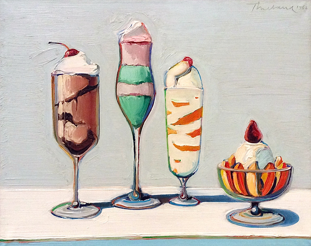 |
| Wayne Thiebaud, b. 1920 Confections, 1962 SFMOMA's regular collection |
 |
| Wayne Thiebaud, b. 1920 Student, 1968 |
 |
| Wayne Thiebaud, b. 1920 Girl with a Pink Hat, 1973 |
 |
| Wayne Thiebaud, b. 1920 Sunset Streets, 1985 |
 |
| Wayne Thiebaud, b. 1920 Flatland River, 1997 |
 |
| Wayne Thiebaud, b. 1920 Valley Streets, 2003 |
 |
| Wayne Thiebaud, b. 1920 Canyon Mountains, 2012 |
Ellsworth Kelly, 1923-2015
New Yorker Ellsworth Kelly, who just died this past December, was the ultimate minimalist. Minimalism is an approach to art that aims to produce maximum impact with limited means. Kelly confined art to explorations of primary colors and simple geometrical shapes, and the interaction between them. He gave the results importance by making them large and imposing.
The following examples are from a series of multi-panel works from the Fisher collection.
The following examples are from a series of multi-panel works from the Fisher collection.
 |
| Ellsworth Kelly, 1923-2015 Red Green, 1968 |
 |
| Ellsworth Kelly, 1923-2015 Black Triangle with White, 1976 |
 |
| Ellsworth Kelly, 1923-2015 Yellow Relief with Black, 1993 |
 |
| Ellsworth Kelly, 1923-2015 Red Curves, 1996 |
 |
| Ellsworth Kelly, 1923-2015 Red on Red, 2001 |
 |
| Ellsworth Kelly, 1923-2015 Curve XXI, 1978-1980 |
 |
| Ellsworth Kelly, 1923-2015 Untitled (Mandorla), 1988 SFMOMA regular collection |
 |
| Ellsworth Kelly, 1923-2015 Spectrum Colors Arranged by Chance, 1951-53 SFMOMA regular collection |
 |
| Ellsworth Kelly, 1923-2015 Spectrum I, 1953 SFMOMA regular collection |
Gerhard Richter, born 1932
German artist Gerhard Richter has three completely different modes. One is to paint blurry copies of photographs, whether portraits, objects, or scenes. The second is to create intensely contrasting abstractions using various devices to scrape the paint into layers. The third is to experiment with color in a flat, impersonal manner.
 |
| Gerhard Richter, b. 1932 Cityscape Madrid, 1968 |
 |
| Gerhard Richter, b. 1932 Two Candles, 1982 |
 |
| Gerhard Richter, b. 1932 Seascape, 1998 |
 |
| Gerhard Richter, b. 1932 The Reader, 1994 SFMOMA regular collection |
 |
| Gerhard Richter, b. 1932 Janus, 1983 |
 |
| Gerhard Richter, b. 1932 Abstract Painting, 1992 |
 |
| Gerhard Richter, b. 1932 256 Colors, 1974/1984 |
 |
| Gerhard Richter, b. 1932 Mirror, Blood Red, 1991 |
 |
| Gerhard Richter, b. 1932 Strip, 2012 SFMOMA regular collection |
Chuck Close, born 1940
New Yorker Chuck Close paints only faces. He first became known for large-scale, photorealistic portraits using pencil or watercolor.
 |
| Chuck Close, b. 1940 Gwynne, 1982 |
Then he began experimenting with different media, such as fingerprints made from an ink-pad.
To transform photographs into massive images, Close uses a grid system. Gradually, he began focussing on the grid itself, treating each cell as a design element.
 |
| Chuck Close, b. 1940 Phyllis, 1981 |
 |
| Chuck Close, b. 1940 Lorna, 1995 |
 |
| Chuck Close, b. 1940 Roy I, 1994 |
 |
| Chuck Close, b. 1940 Agnes, 1998 |
 |
| Chuck Close, b. 1940 Lorna, 2006 |
Anselm Kiefer, born 1945
German painter Anselm Kiefer is concerned with the history and culture of his country, and dwells on scenes of destruction and loss in wall-size paintings that often incorporate materials such as straw, ash, clay, lead, and shellac. He also does sculptural installations on the same themes.
 |
| Anselm Kiefer, b. 1945 Margarethe, 1981 |
 |
| Anselm Kiefer, b. 1945 Wayland’s Song, 1982 |
 |
| Anselm Kiefer, b. 1945 Sulamith, 1983 |
 |
| Anselm Kiefer, b. 1945 Operation Sea Lion, 1983-84 |
 |
| Anselm Kiefer, b. 1945 Melancholia, 1991 |
The Big Five
Women in the Fisher Collection
Who was that again? In chronological order.
Wayne Thiebaud is a California artist whose style is realistic with romantic overtones.
New Yorker Ellsworth Kelly was the ultimate minimalist painter.
German artist Gerhard Richter does blurry paintings of photographs, scraped paintings with intense colors, and detached color experiments.
American Chuck Close paints only faces, usually on a very large scale, in a variety of techniques.
German Anselm Kiefer dwells on scenes of destruction using natural materials such as weeds and lead.
Now when you visit SFMOMA, instead of saying, "Huh?" you can say, "Oh sure. I recognize his style."
Wayne Thiebaud is a California artist whose style is realistic with romantic overtones.
New Yorker Ellsworth Kelly was the ultimate minimalist painter.
German artist Gerhard Richter does blurry paintings of photographs, scraped paintings with intense colors, and detached color experiments.
American Chuck Close paints only faces, usually on a very large scale, in a variety of techniques.
German Anselm Kiefer dwells on scenes of destruction using natural materials such as weeds and lead.
Now when you visit SFMOMA, instead of saying, "Huh?" you can say, "Oh sure. I recognize his style."
Women in the Fisher Collection
 |
| Agnes Martin, 1912-2004 Night Sea, 1963 |
 |
| Agnes Martin, 1912-2004 Drift of Summer, 1965 |
 |
| Agnes Martin, 1912-2004 Untitled #9, 1995 |
 |
| Joan Mitchell, 1925-1992 Harm’s Way, 1987 |
 |
| Lee Krasner, 1908-1984 Polar Stampede, 1960 |
 |
| Pat Steir, b. 1938 Three Pointed Waterfall, 1990 |
Women Artists in the Collection of SFMOMA
Fortunately, SFMOMA's regular collection includes paintings by several other women.
Possibly the greatest portrait painter of the 20th century was Alice Neel. Although Chuck Close depicted faces, he didn't do character studies, in the tradition of Rembrandt, for instance. Neil's portraits are notable for their expressionistic use of line and color and their insight into character.
 |
| Alice Neel, 1900-1984 Geoffrey Hendricks and Brian, 1978 |
 |
| Dorothea Tanning, 1910-2012 Self-Portrait, 1944 |
 |
| Jay DeFeo, 1929-1989 The Verónica, 1957 |
 |
| Joan Brown, 1938-1990 After the Alcatraz Swim 1, (1975) |
 |
| Vija Celmins, b. 1938 Night Sky #16, 2001 |
 |
| Hung Liu, b. 1948 The Botanist, 2013 |
 |
| Dana Schutz, b. 1976 Ear on Fire, 2012 |
Modern and Contemporary Sculpture
The Fisher collection also includes several masterpieces of 20th-century sculpture. Combined with SFMOMA's regular collection, the museum is now able to show a fairly complete survey of sculpture in that century. The following examples come from both collections, as noted.
Sculptors adopted abstraction more readily than painters. It seemed natural to create whole new forms instead of laboring to imitate reality.
Women sculptors of the 20th century were so bold and ingenious that the art world was less concerned with their gender than in painting.
The first important abstract sculptor was Englishman Henry Moore. In the first half of the century his works dominated the museum landscape.
 |
| Henry Moore, 1898-1986 Working Model for ‘Oval with Points,’ 1969 Fisher Collection |
 |
| Barbara Hepworh, 1903-1975 Sphere with Inner Form, 1963 Fisher Collection |
 |
| Isamu Noguchi, 1904-1988 Shodo Flowing, 1959 Fisher Collection |
 |
| Isamu Noguchi, 1904-1988 Cronos, 1947-1964 SFMOMA Collection |
 |
| Isamu Noguchi, 1904-1988 Samothrace, 1984 Fisher Collection |
 |
| Beverly Pepper, b. 1924 Tarquinia Cone Column, 1981 Fisher Collection |
 |
| Ruth Asawa, 1926-2013 Untitled (S.046abcd), c. 1960 Collection of SFMOMA |
 |
| Ruth Asawa, 1926-2013 Untitled (S.114, Hanging, Six-Lobed Continuous Form with a Form), c. 1960 Collection of SFMOMA |
 |
| Donald Judd, 1928-1994 Untitled, 1988 Fisher Collection |
 |
| Dan Flavin, 1933-1996 the diagonal of May 25, 1963 Collection of SFMOMA |
 |
| Dan Flavin, 1933-1996 “monument” for V. Tatlin, 1969 Fisher Collection |
 |
| Dan Flavin, 1933-1996 untitled (to Barnett Newman) two, 1971 Collection of SFMOMA |
 |
| Carl Andre, b. 1935 Copper-Zinc Plain, 1969 Fisher Collection |
 |
| Carl Andre, b. 1935 Belgica Blue Tin Raster, 1990 Fisher Collection |
 |
| Carl Andre, b. 1935 13th PbFe Triangle, 1987 Fisher Collection |
 |
| Carl Andre, b. 1935 9th Cedar Corner, 2007 Fisher Collection |
 |
| Carl Andre, b. 1935 Furrow, 1981 Fisher Collection |
 |
| Mark di Suvero, b. 1933 Che farò senza Eurydice, 1959 Collection of SFMOMA |
 |
| Richard Serra, b. 1938 Floor Pole Prop, 1969 Fisher Collection |
 |
| Richard Serra, b. 1938 House of Cards, 1969/1978 Fisher Collection |
 |
| Richard Serra, b. 1938 1-1-1-1, 1969/1986 Fisher Collection |
 |
| Richard Serra, b. 1938 Sequence, 2006 Fisher Collection |
 |
| Joel Shapiro, b. 1941 Untitled, 1989 Collection of SFMOMA |
 |
| Richard Long, born 1945 Autumn Circle, 1990 Fisher Collection |
The only work by a black artist that was shown in the opening exhibit of the Fisher Collection was a sculpture by Martin Puryear. However, SFMOMA has a long-standing commitment to Puryear, so they complemented the Fisher piece with two from their regular collection. The unique element about his style is his concern for hand craftsmanship Notice that these works are from the 21st century.
 |
| Martin Puryear, b. 1941 Two Plus Seven, 2004 Collection of SFMOMA |
 |
| Martin Puryear, b. 1941 Title unrecorded Collection of SFMOMA |
 |
| Martin Puryear, b. 1941 Malediction, 2007 Fisher Collection |
 |
| Anish Kapoor, b. 1954 Vortex, 2004 Collection of SFMOMA |
 |
| Anish Kapoor, b. 1954 Vortex, 2004 (detail) |
 |
| George Segal, 1924-2000 Woman Shaving Her Leg, 1963 Fisher Collection |
 |
| Duane Hanson, 1925-1996 Policeman, 1994 Fisher Collection |
 |
| Duane Hanson, 1925-1996 Policeman, 1994 Fisher Collection |
 |
| Charles Ray, b. 1953 Sleeping woman, 2012 Collection of SFMOMA |
 |
| Charles Ray, b. 1953 Sleeping woman, 2012 Collection of SFMOMA |
 |
| Kiki Smith, b. 1954 Guard, 2005 Collection of SFMOMA |
 |
| Marc Quinn, b. 1964 Zombie Boy (City), 2011 Collection of SFMOMA |
 |
| Marc Quinn, b. 1964 Zombie Boy (City), 2011 (detail) Collection of SFMOMA |
Another British sculptor, Antony Gormley, used metal bars to create a human figure that expresses the way sub-atomic particles and energy that make up our bodies is integrated with those that compose the universe around us.
 |
| Antony Gormley, b. 1950 Quantum Cloud VIII, 1999 Fisher Collection |
Another group of sculptors re-created or re-used real objects with some sort of symbolic distortion. Claes Oldenburg and Coosje van Bruggen generally recreated common objects on a massive scale.
 |
| Claes Oldenburg and Coosje van Bruggen Inverted Collar and Tie — Third Version, 1993 Fisher Collection |
 |
| Claes Oldenburg and Coosje van Bruggen Geometric Apple Core, 1991 Fisher Collection |
 |
| Sherrie Levine, b. 1947 Fountain, After Marcel Duchamp, 1991 Collection of SFMOMA |
 |
| Jeff Koons, b. 1955 Large Vase of Flowers, 1991 Collection of SFMOMA |
 |
| Ai Weiwei, b. 1957 Colored Vases, 2007 Collection of SFMOMA |
The New Building
The new wing of SFMOMA— essentially a whole new building—works quite well, especially considering the architectural challenges. The Norwegian architecture firm Snohetta crammed a huge structure that triples the museum's exhibition area into a long, improbably-shaped space that didn't even seem to exist before they started. The galleries have abundant, even light and a layout that is fairly easy to figure out. Wide halls and gathering places will facilitate the flow of crowds when it opens May 14.
Aesthetically, the new structure is a little disappointing. The exterior is an off-white cloak of fiberglass-reinforced polymer panels that are rippled to suggest the waves in the bay, or perhaps a layer of fog. It sticks out like a sore thumb above the classy original building by Mario Botta. This awkward choice is justified by the fact that stone or brick cladding would have made the building too heavy. It is also noteworthy that artificial cladding with an arbitrary pattern seems to be part of a contemporary pattern, as the new Broad Museum in Los Angeles has a similar facing with a net-like pattern.

The interior is a good example of Minimalism. The galleries do nothing to call attention to themselves. The flooring is bland, compared to the rich black stonework in the Botta building, and the woodwork is pale birch, compared to the warm teak-colored woodwork in the original building. These decisions were probably economic, but they also create a very modest, disappearing sort of atmosphere. The aesthetic touches are exterior balconies for sculpture and views, long hallways with well-placed stairways, and plenty of windows to connect the museum with the city.
The expanded SFMOMA, with its spacious new building and its impressive new Fisher Collection, is a great asset to the city and is bound to be a major tourist draw.
Aesthetically, the new structure is a little disappointing. The exterior is an off-white cloak of fiberglass-reinforced polymer panels that are rippled to suggest the waves in the bay, or perhaps a layer of fog. It sticks out like a sore thumb above the classy original building by Mario Botta. This awkward choice is justified by the fact that stone or brick cladding would have made the building too heavy. It is also noteworthy that artificial cladding with an arbitrary pattern seems to be part of a contemporary pattern, as the new Broad Museum in Los Angeles has a similar facing with a net-like pattern.

The interior is a good example of Minimalism. The galleries do nothing to call attention to themselves. The flooring is bland, compared to the rich black stonework in the Botta building, and the woodwork is pale birch, compared to the warm teak-colored woodwork in the original building. These decisions were probably economic, but they also create a very modest, disappearing sort of atmosphere. The aesthetic touches are exterior balconies for sculpture and views, long hallways with well-placed stairways, and plenty of windows to connect the museum with the city.
The expanded SFMOMA, with its spacious new building and its impressive new Fisher Collection, is a great asset to the city and is bound to be a major tourist draw.
Subscribe to:
Posts (Atom)